


By: Justin Sandefur, APHRC-CGD Data for African Development Working Group Member
*This blog was originally posted on the Center for Global Development website. View the original post here.
I’m a little late to this, but recently Chris Blattman set off an interesting debate by criticizingBill Gates’ recent interest in the quality of GDP statistics in Africa. Chris worries that Gates is falling into the trap of “seeing like a state” — i.e., from the top down, obsessing over national statistics — rather than a bottom-up entrepreneur who, presumably, couldn’t care less about aggregate GDP numbers.
As part of a working group looking at “Data for African Development” together with the African Population and Health Research Center in Nairobi, I’m here to defend the idea of “seeing like a state” in 21st century Africa. I just think Bill Gates is doing it wrong.
Seeing like a State vs Seeing like a Donor
I don’t mean to pick on Bill Gates. Most other donors do likewise. What they promote is not seeing like a state – i.e., collecting data to answer policymakers questions – but rather “seeing like a donor”. Countries are the unit of analysis and need to be lined up into comparable data points. And African governments are paid to collect statistics whose main raison d’etre is populating a World Bank or UN database.
Consider education in Kenya. Donors need to allocate aid across countries, so they end up looking at maps like the one on the left below, which shows net primary enrollment rates for 52 African countries from the World Bank’s 2010 World Development Indicators. This is a great map for a donor sitting in Washington, because it allows them to evaluate Kenyan and Tanzania performance in primary schooling (by one very crude metric) on a comparable basis.
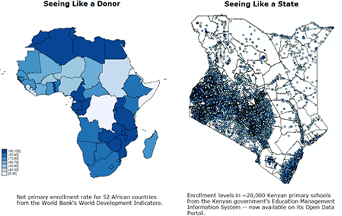
But the map on the left is pretty useless for Kenyan policymakers. Why should they care how they compare to Egypt? They need to know which schools need new textbooks and which ones need new teachers. They get that from the country’s Education Management Information System (EMIS), three times a year, for all twenty-thousand government schools in the country.
Ken Opalo trolled Chris’s original blog post quite beautifully with a counter-post titled, “Does Chris Blattman hate state capacity?” (The answer was “no”.) But Ken made a strong case that governing a place like Kenya would require both reliable data, and more disaggregated data – possibly linked to the recent devolution of power to counties.
International comparability be damned. Governments need disaggregated, high frequency data linked to sub-national units of administrative accountability.
Back in here in donor-land (DC), the mood is very different. There are currently a lot of proposals floating around to collect more internationally-comparable household surveys – for instance, as part of the post-2015 MDG agenda. The Gates Foundation is funding tailored surveys on agriculture and family planning across the region. USAID runs a different set of agriculture surveys for its “Feed the Future” initiative. The World Bank and various UN agencies have their own competing and often duplicative surveys, all of which get foisted on national statistics bureaus. But these small-sample one-off surveys answer very few of the questions that domestic policymakers are asking — largely because they’re too aggregated, too infrequent, and not linked to sub-national units of administrative accountability.
Lest you think this all sounds very top down and Soviet, it turns out seeing like a state is not so different from seeing like a citizen. What is it that citizens are demanding in the movement to open data platforms? People want to know how their school (or clinic, or local council) compares to the one down the road. They want the map on the right – which is in fact now publicly available at kenyaopendata.go.ke.
So the lesson here is that donors need to back off, abandon household surveys, and focus on strengthening administrative data systems. Well, not quite.
Big, Dumb Data?
There’s just one problem: the real-time, local-level information coming out of the Open Data Portal appears like it might be, sort of, well, how should I put this… systematically wrong.
Marc Bellemare recently posted a nice critique of the recent enthusiasm for “big data” from a social science point of view. I want to take issue from a policy perspective.
In the Ministry of Education’s administrative data, primary enrollment rates appear to be steadily rising, with a big jump upward in 2003 when Kenya abolished all school fees in government primary schools. But survey data paints a very different picture. Independent figures from the Kenyan National Bureau of Statistics (KNBS) and the Demographic and Health Survey (DHS) show enrollment rates that are completely flat over time. There’s no sign of any increase whatsoever, even when school fees were abolished. (See the graph below. The fact that the level of the blue line is higher than the green line probably tells us more about differences in the two surveys, which use slightly different methodologies. Comparing apples and apples shows no rise in either case.)

So why does administrative data reported by schools differ so much from survey data reported by parents?
Amanda Glassman and I have a working paper forthcoming on this question, looking at these discrepancies between administrative and survey data in education and health across Africa. Here’s a spoiler: when the Ministry of Education abolished primary school fees, it radically changed the incentives for truthful reporting by head teachers. There are some safeguards in place to try to avoid outright lying, but at the end of the day, schools get allocated more teachers and more funding if they report more pupils. So schools have an incentive to exaggerate their numbers. Parents, in contrast, don’t. Incentives, incentives, incentives. The same point applies, Amanda and I hope to show, when you ask agricultural extension workers to report how much maize was grown in their village, or nurses how many patients they saw. Incentives to misreport plague administrative data systems.
This, rather than the need for more duplicative household surveys, is the big challenge facing African statistics. Right now governments face a trade-off between high quality survey data of limited relevance, and low quality administrative data that actually fits their needs. It doesn’t have to be this way. But to overcome the trade-offs donors are going to have to back off with their pet survey projects, and stats bureaus across Africa will need to exert some renewed independence, and stop serving as research consultancies for donors.
Thanks to Amanda Glassman for helpful comments on this post.


